CASE STUDY - MONCTON TACO WEEK LOGO, EXPLAINED.
Designed by : Luke Norrad
Web:http://lukenorrad.com/
Insta: https://www.instagram.com/looknorrad

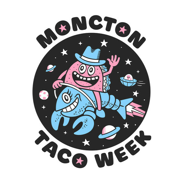
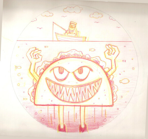
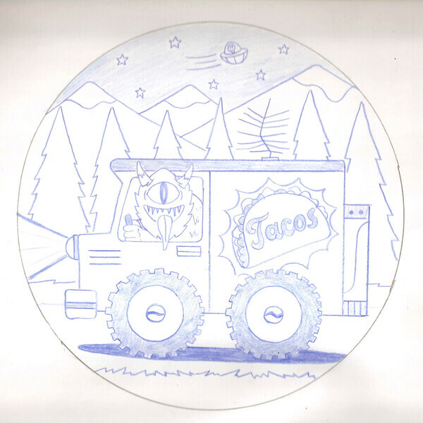
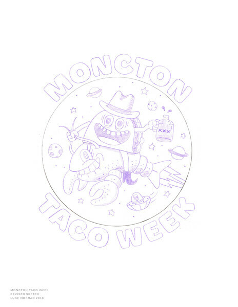
Originally the Moncton Taco Week logo was going to be a Kangaroo holding tacos, with lots of tacos in its pouch drawn by Jared. But then, it didn't really make sense, after multiple drawings, then even flying pigs with halos, executive director Jared Betts decided to call upon an old school buddy from NSCAD University. Jared knew this was a job for Luke Norrad, designer, master letter and logo extraordinaire wizard. He came up with some very cool logos with words, but it wasn't what Jared wanted, they needed to refocus, and "get more weird". They talked it out and Luke could see that it wasn't any ordinary logo, we wanted something memorable, local, while also being weird, simple but complex and funky. The logo hit every angle bang on and tells a story with unique fantasy in an old fashioned cartoon style! I think my words were "Get weird even have alien or monster shorties, it doesn't even have to do with tacos or make sense" Luke thought it should at least have a taco in it, but ran with this and provided 4 ideas.
Showing influences from Luke's passed works they talked about it more over the coming days.
We wanted it to be inspired by:
-Atlantic Canada (especially points if crustaceans were involved)
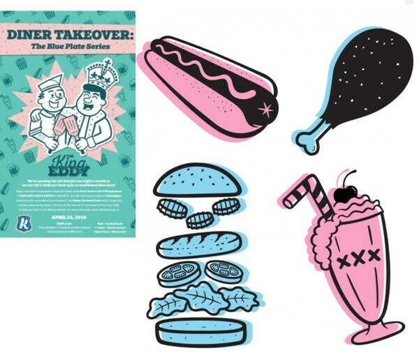
-Old fashioned fast food illustrations (think 60's diner neon lights of ice cream, dogs, ice cream, party burgs)
-specifically pastel blue and pink to give it that authentic old style look
-inspired by 30s-60s old cartoons with large wonky eyes and surrealism characters
-we also wanted to go the next level by using crustaceans in a space setting with aliens


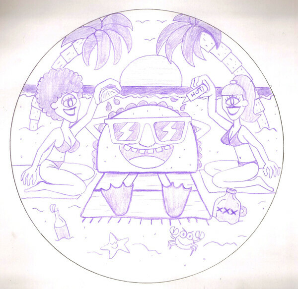
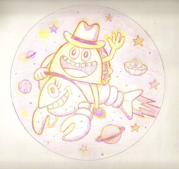
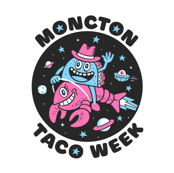
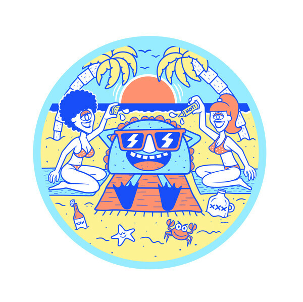
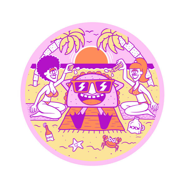
There was many incredible concept designs, specifically the party cyclops alien babes squirting a sun bathing taco on the beach on a mysterious planet, with party crabs and starfish playing about. But, it was clear that there was one logo that knocked the tacos off Jerry. One logo had a cowboy taco riding a lobster rocket through outer space.
Originally it was getting drunk off space crustacean potions, flying through space, hence the wild eyes. But, we decided, we wanted it to be family friendly. Kids, don't drink crustacean space juice ok!?


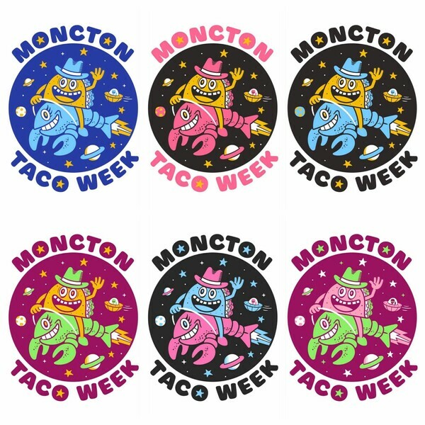
So we found the design and then Jared said "Luke give me some hot color combos, weird and different, but also the baby blue and pink, lets see some options"


This was a SPECIAL LOGO, after hours of consideration, Jared asked for the inverse of colors, with the pink a little more baby'd out with a shade lighter to blend with the same hue as the blue (two artists working together can always get a little (a lot) technical, but we knew what we wanted.....then poof, WE HAVE A LOGO!
Since Luke liked a few other logos so much, he went on to fully design them as well. They were all delicious options, but the crustacean alien taco cowboy stole the heart of Jerry.
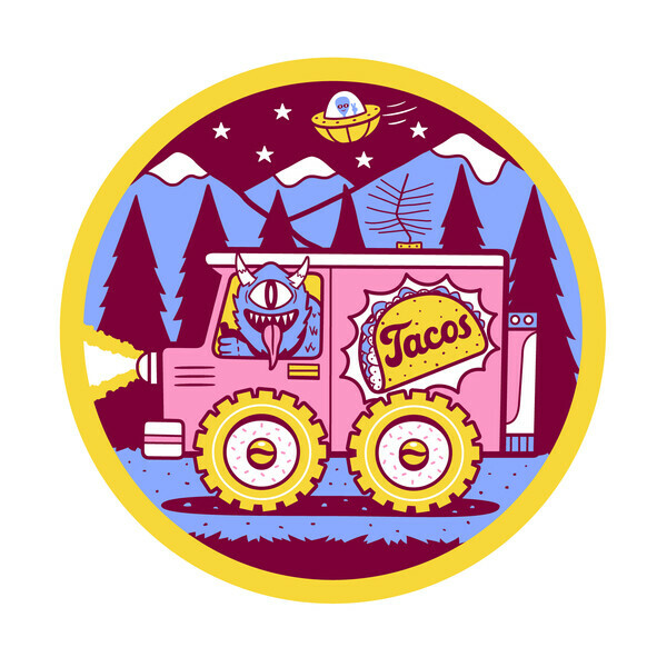
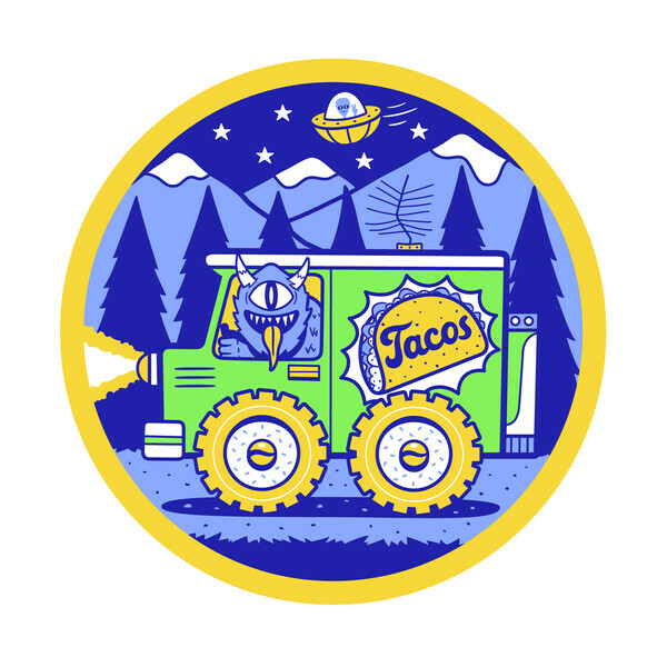
Below is some of the other options rendered and colored.


Sometimes ideas can get complex and specific, but with the right designer, your "too much or too wild" ideas will be just right.
Thank you Luke for working with me to produce this master piece.
❤🧚 🧚❤
🧚❤
________________________________________________________________________

4 Tips For Drool-Worthy Food Photos on Your Phone During Moncton Taco Week by @EatWithJessie
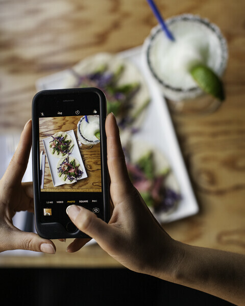
@EatWithJessie / Jessica Emin is a photographer from Halifax who specializes in food and drink photography & food styling. Here she gives you a few tips on making the most of your phone snaps of the tacos while you eat your way around Moncton for Taco Week!

Tip #1 Natural Light is Best
When you are taking photos of your food, it’s best to use natural light. If you’re in a restaurant, getting close to a window is best. Try to chose a spot for your photo that doesn’t have hard light, by this I mean directly in the sun, but rather a bright spot. Avoid depending on the overhead lights that can make food photos look less appealing and often turn photos an orangey hue. But if you must resort to this, ot if you are taking photos at night with only the restaurant lights to depend on, make sure to use tip #2.
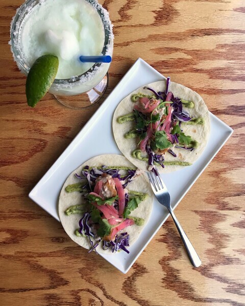
Photograph taken on a phone, in natural light; prefereable.

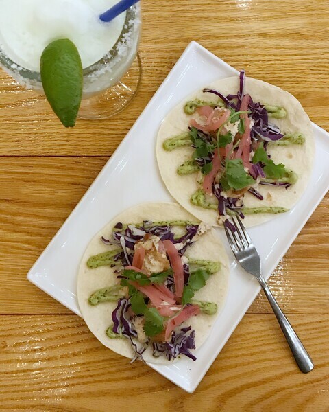
Photograph taken on a phone, with restaurant lighting as main source; less appealing.

Tip #2 Balance Your Color
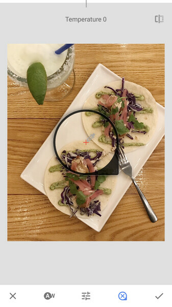
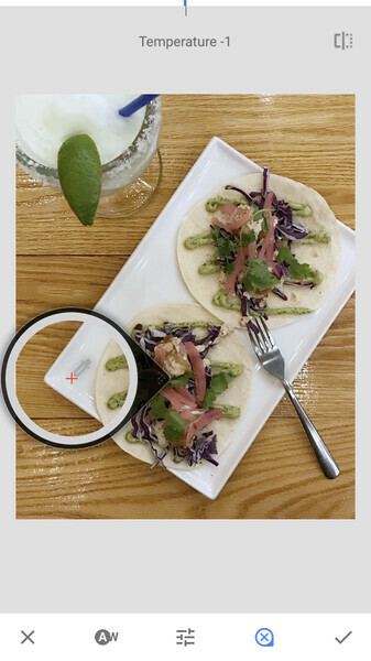
Most photo editing applications, such a Snapseed, VSCO, Lightroom for mobile etc. have a setting called white balance, which helps make food look better in your photos. When we take food photos on our phone in restaurants they are sometimes yellowish, from incandescent light or warm light bulbs. In these apps you can often pick something in the frame that is meant to be white, and correct it, whether it be a white plate, or sour cream. You’ll see your photo go from something that might not even resemble food, to it looking delicious, just by it being more recognisable. Whether you are taking the photo in natural light, or under ceiling lights, you can try and improve the white tones this way. Your entire image will look better because all the color becomes more correct! Also, avoid filters which change the white balance.
White balance with restaurant lights before correction.
White balance with restaurant lights after correction.
Tip #3 The Perspective
Phones are often not equipped with depth of field, which allows a professional camera to focus attention on a certain object, like your food. Because of this, when shooting with a phone, you’ll often get better results with a shot from top down. Taking a photo from above will allow for the whole plate to be shown, without other objects, people or the room distracting from the photo. Having your phone level with the surface you are shooting on will also help.
Tip #4 The Setting
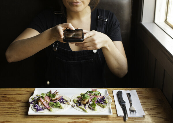
If you’re really keen on getting the best shot possible, bring in some of the objects around you. Have a nice cocktail, a napkin, a friends hands? These will all give context to the photo. Oh, and let people know where you are; restaurants always appreciate being tagged & tag the festival too! @monctontacoweek #monctontacoweek
